Senior Product Designer for World’s Edge
- User Interface design in Figma
- Branding style guide in Adobe Indesign
- Key art layouts in Adobe Photoshop
- Color hierarchy
- Typography
- Iconography in Adobe Illustrator
- Icon animation in Adobe After Effects
- Requirements gathering & Stakeholder input
- UX Strategy
- Competitive audit
- Analytics analysis
- User journey mapping
- Wireframes
- Design iteration and evaluation
*Key art paintings and logos by Microsoft. In-game style guide by Relic Entertainment.
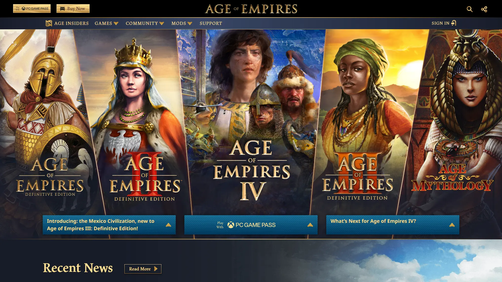
I was brought on board to Microsoft and the Xbox Global Publishing team for something huge: to establish a cohesive franchise brand design for 5 titles across 25 years. I was fortunate enough to be part of the team long enough to do it twice; once for remasters of Age I, II, and III, and again for the launch of Age IV.
I needed to balance the famous key arts and logos of all Age of Empires titles in one layout. I researched franchise arrangements in both games and film. For the remasters I found inspiration in 15th century French parade armor to adorn the arrangement. For Age IV, I simplified the design to brilliant gold lines and dark blue fabric to reinforce the new branding and modern feel.
The resulting design delighted players, emphasized the newest titles, and reinforced the franchise as a whole.
Branding in Motion
- Video editing in Adobe After Effects
- 3D camera movement
- 3D lighting
- Particles in Trapcode Particular
- Fabric background in Adobe Photoshop
- World’s Edge logo in Adobe Illustrator
*Xbox logo by Microsoft. Relic logo and village illustrations by Relic Entertainment.
Nearing the end of development on Age IV, the team at Relic Entertainment was stretched thin. Because I had already worked with the new branding extensively with marketing efforts ahead of launch, I was asked to come up with the opening video sequence for the game. The video required clearly showing the logos from Xbox Game Studios, Relic Entertainment, and my new logo for World’s Edge.
I leveraged existing village illustrations from the game and vector logos. The “blue couch” texture in-game wasn’t large enough for the effect I wanted to pursue, so I recreated it at a larger scale in Photoshop. “Ink as light” was a founding principle behind Age IV’s branding, and burning embers a common effect in the game. I connected the logos through this brand principle, attaching a light source and tracking movement through a 3d camera in After Effects.
The resulting design delighted Xbox, Relic, World’s Edge, and our players with the promise of a quality experience. Audio by the outstanding Todd Masten.
Style for Generations
- Style guides for two generations of Age of Empires
- Color theory and selection
- Typography: Font selection and scaling
- Button styles
- Interactions
- Cultural design influences and research
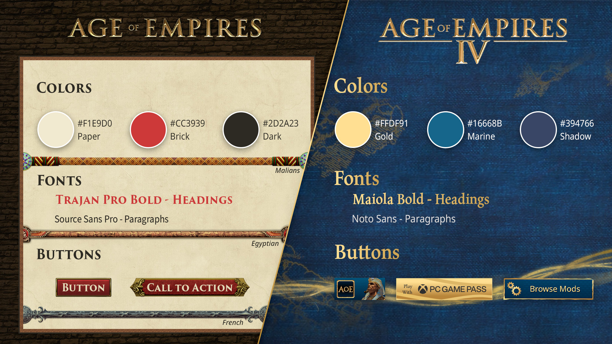
I created style guides for two generations of the Age of Empires franchise. With the launch of Definitive Editions of Age I, Age II and Age III, in collaboration with additional designers, I created a style influenced by the classic series of games. I embellished the styles with cultural influences from cultures within the game by researching traditional art, clothing, weapons, and armor.
Then I did it again! I collaborated with designers at Relic Entertainment to create a modern style guide for Age IV. I expanded the style guide to encompass the whole franchise of games. Both of these style guides helped marketing and social media teams, as well as external partners and even fans in unified visual messaging for the Age of Empires franchise.
World’s Edge Studio Logo
- Logo design in Adobe Illustrator
- Custom typography
- Requirements gathering & Stakeholder input
- Design iteration and evaluation
- Usage guidelines
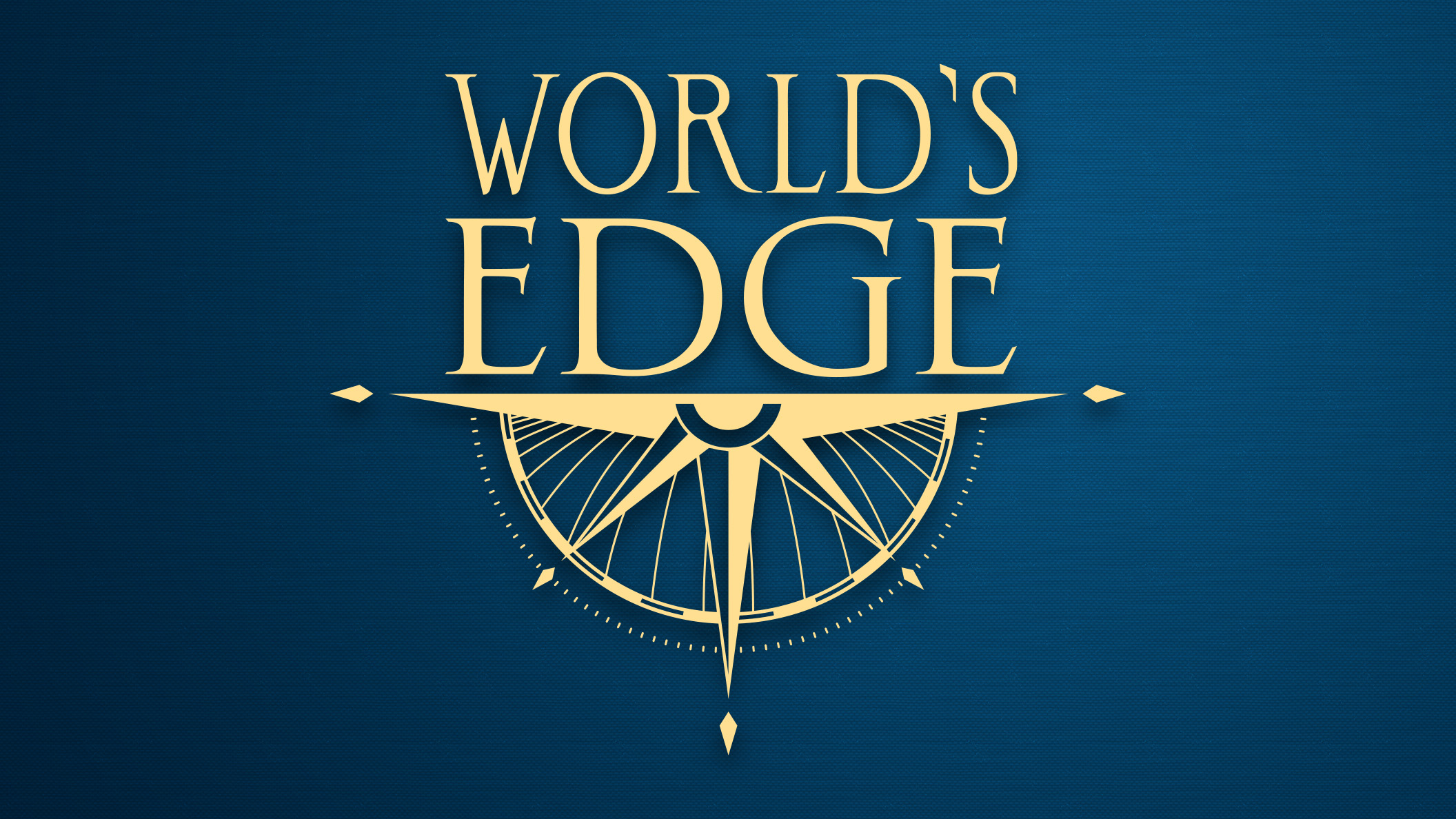
It was tough to leave behind projects like Ori and Crackdown but I was thrilled to continue my journey designing for the Age of Empires franchise with the founding of World’s Edge. My first task with the new studio: design a logo to represent the dreams and aspirations of the team.
A tall order to be sure! There’s a lot riding on a first impression, a flag to be hoisted over our victories. I explored a ton of inspiration, past and present, from all sorts of creative endeavors. Iteration after iteration, I consulted with art and creative directors, executive producers, and the head of our studio. So many directions to represent the custodians of Age of Empires.
And that’s where I found the key and direction. I used Trajan, the font associated with all Age of Empires logos, as a base. To express the aspirations of the team, I elevated the corpus size, or x-height of the font. This technique I learned through my study of typography and signature analysis. This new simple stacked text logo says a lot for just two words. It stands proud side by side while blending in with the logos of our colleagues across Xbox.
Later, with the creation of some studio apparel, I was tasked with amending the logo with a bit more flare. Through more iterations I finally landed on a solid “direction”, and a tribute to our founding head of studio Shannon Loftis, with a compass rose.
Anniversary Edition Branding
- Typography, double border and knot in Adobe Illustrator
- Rendering and layout in Adobe Photoshop
- Requirements gathering & Stakeholder input
- Design iteration and evaluation
- Usage guidelines
*keyart paintings by Craig Mullins
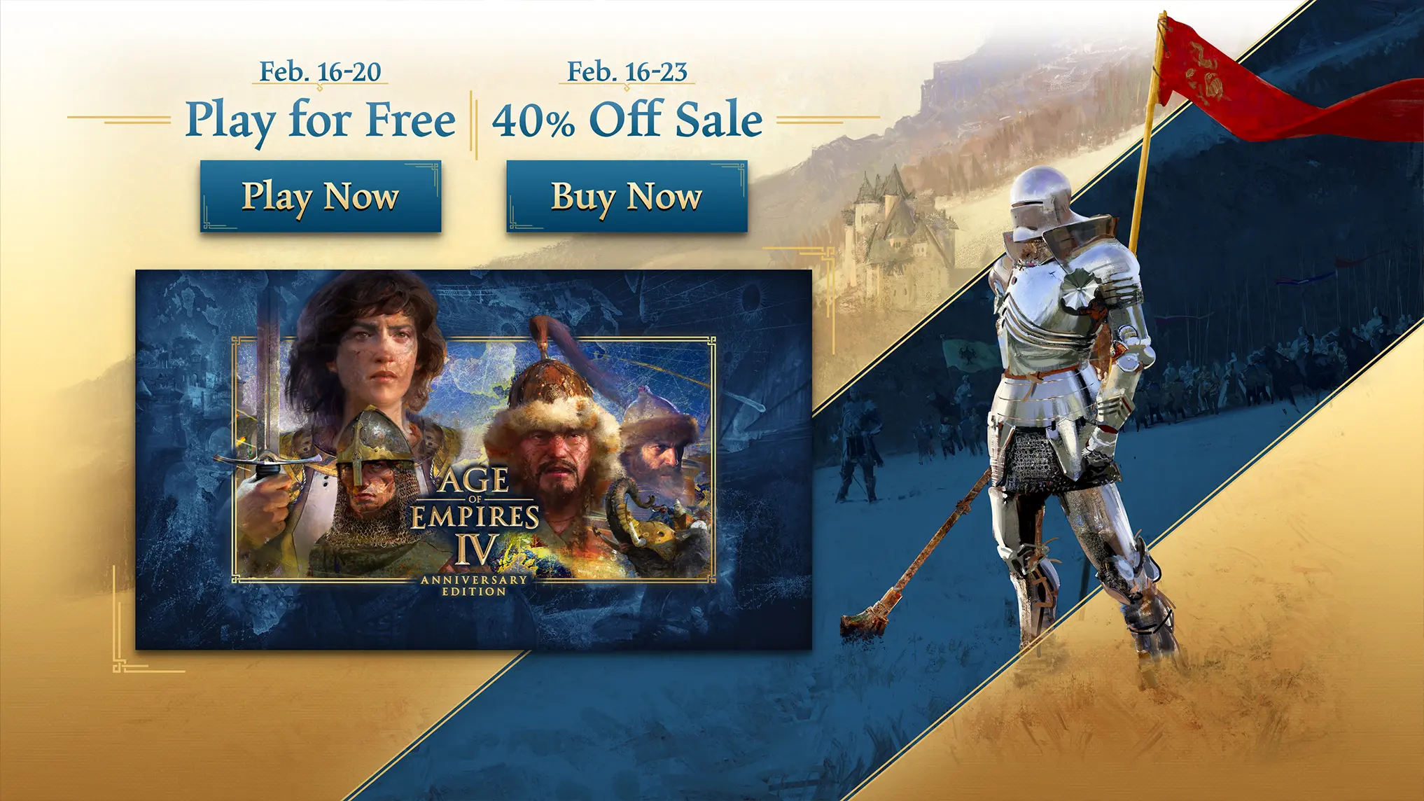
For the first year anniversary of Age IV I was asked to come up with branding for a special anniversary edition. On a bit of a tight timeline there was a push to make the branding more modern. I thought to elevate and frame this special edition, I would reuse the new branding I had established with the Ottomans and Malians logo, the plan was to reuse those elements for future DLC to start. The keys being a double line thin gold border with simple knot, over dark blue.
I combined the branding elements with the Age IV key art to frame the characters and highlight “Anniversary Edition”. I went on to create supplemental marketing materials using the amazing Craig Mullins artwork with the blue and gold elements.
Product Design – Learn to Play
- Product inception
- Competitive research
- User Interface design in Figma
- Color hierarchy
- Typography
- Iconography in Adobe Illustrator
- Icon animation in Adobe After Effects
- Requirements gathering & Stakeholder input
- UX Strategy
- Analytics analysis
- User journey analysis
- Wireframes
- Design iteration and evaluation
*Screenshots, video capture, and text content by Matthew Turk. Programming development by Heather Sullivan.
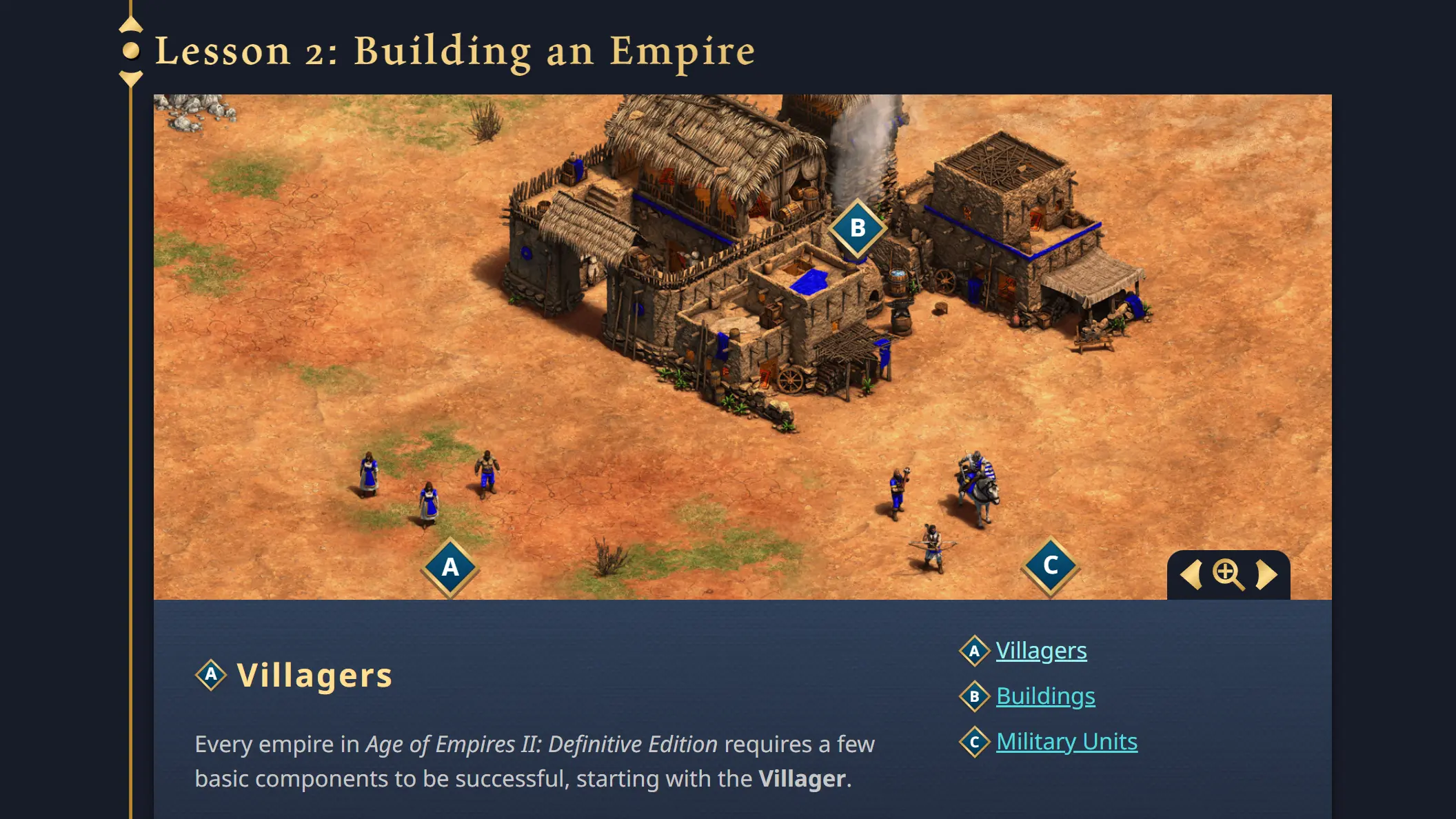
During my competitive research leading to the new website design for the launch of Age IV, I discovered that Learning to Play was an untapped area among our RTS competitors. I expanded my research outside of RTS competitors to other kinds of games and software, looking for ways to create an effective onboarding program for what may be the highest learning curve among game genres. I leveraged my previous experience developing the LegendSmith app and worked with the Age community team to develop a web-based program that could aid players getting into Age of Empires, prior to making a purchase decision. At the launch of Age II: DE on Xbox the Learn to Play Age program became the #1 destination for players, leading to more first-time franchise customers.
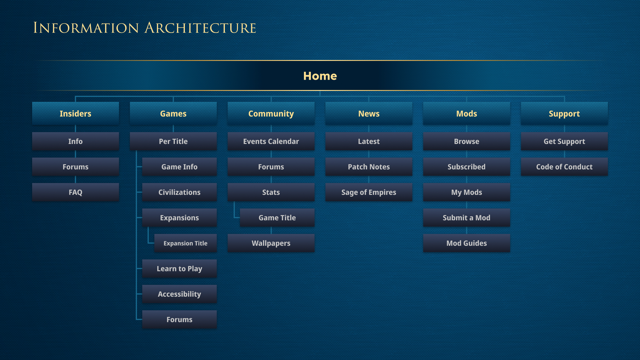
Information Architecture
- Information architecture
- Optimized user flows
- User journey mapping
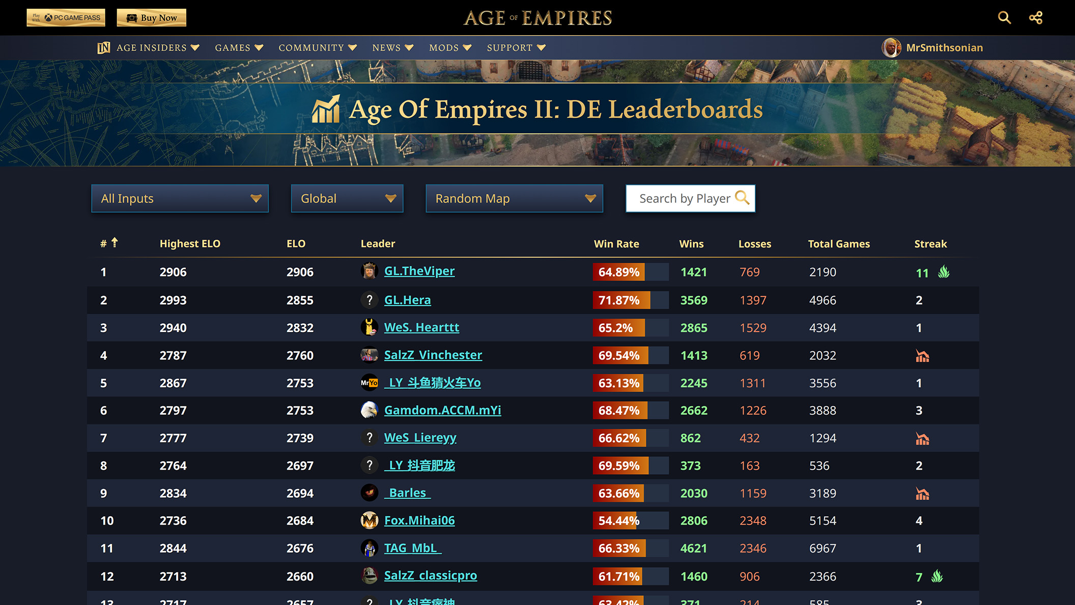
- Data visualizations
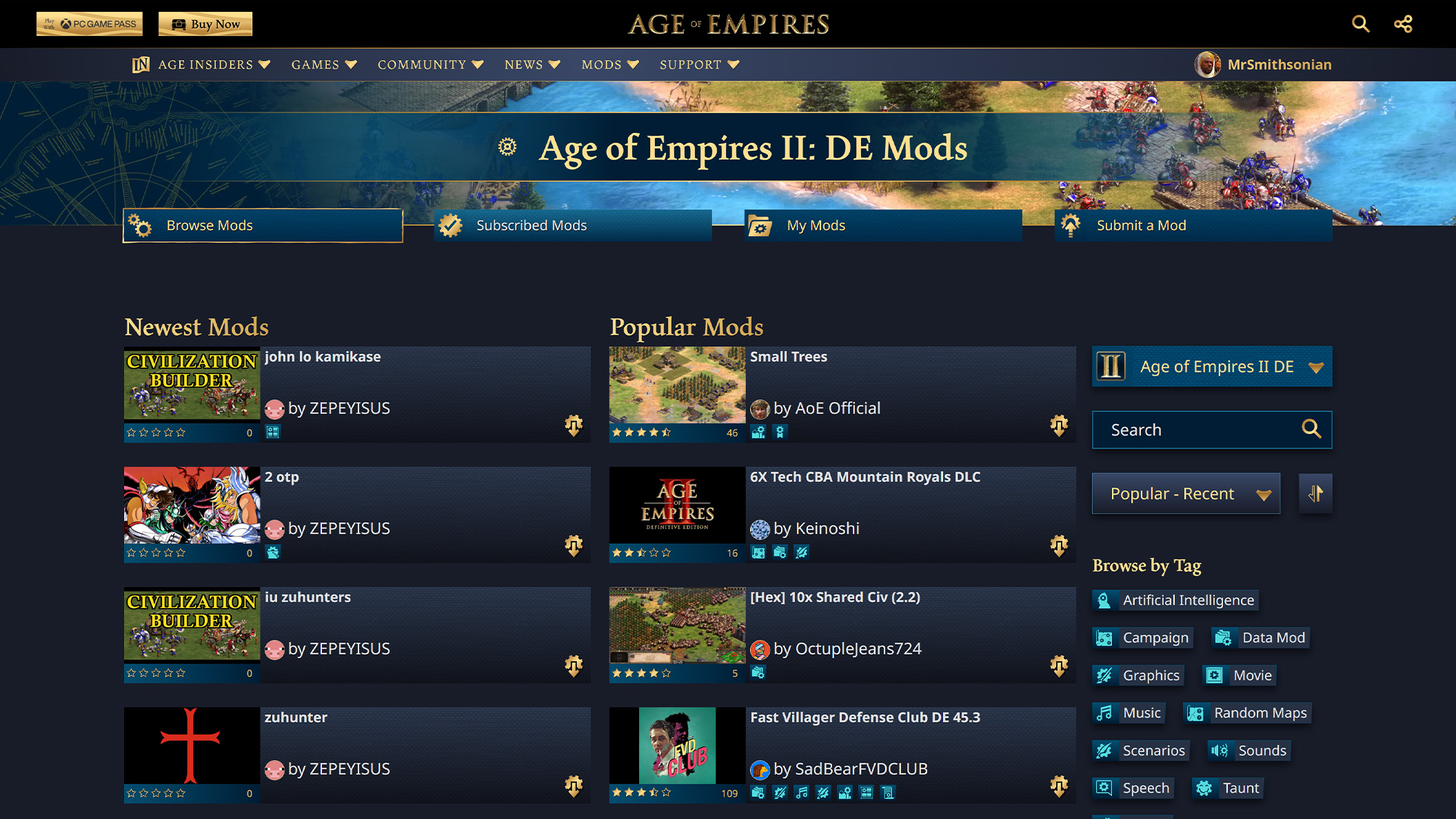
- Responsive design
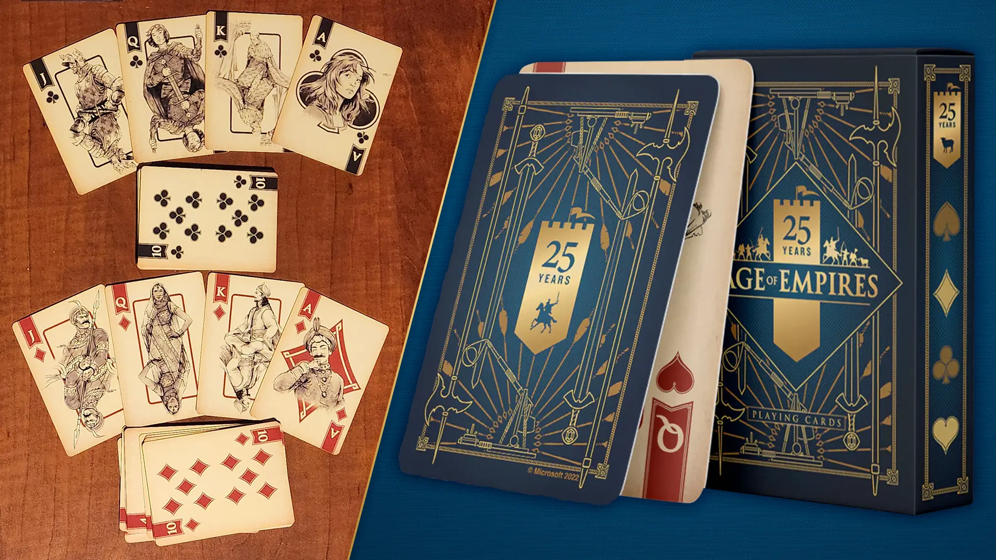
Evolving the Brand
- Brand direction and concepts for 25th Anniversary
- Animation in Adobe After Effects
- Design iteration and evaluation
- Logo design in Adobe Illustrator
- Logo rendering in Adobe Photoshop
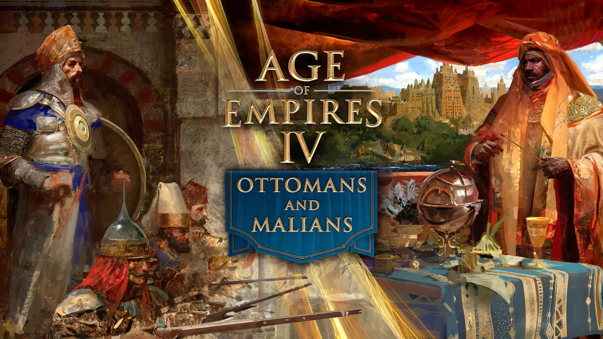
- Keyart merger for Ottomans and Malians
- Keyart layouts for retail, marketing, socials, and events
- Brand direction to external team for Fan Preview event team
*Age IV logo by Microsoft. Keyart paintings by Craig Mullins.
Icons for Accessibility
- Iconography in Adobe Illustrator
- Animation in Adobe After Effects
- Requirements gathering & stakeholder input
- Competitive research
- Design iteration and evaluation
- Icons for game, website, marketing and social communications
- Follows Microsoft Fluent Design methodology
After an internal accessibility seminar I took extended training to earn the Microsoft “Accessibility in Action” badge. I’ve always had a passion for accessibility in my projects and this extended training helped me find new ways to make our products more accessible to everyone. I lent this expertise to our content creators, development partners at Relic Entertainment and Forgotten Empires, and other divisions of Microsoft.
I created the Age IV site design with accessibility and localization in mind, accounting for EFIGS languages and fans with limited visibility. In addition, iconography can cross language barriers to aid in localization. I created 180+ icons to help fans from around the world navigate Age of Empires.

