Competitive Analysis
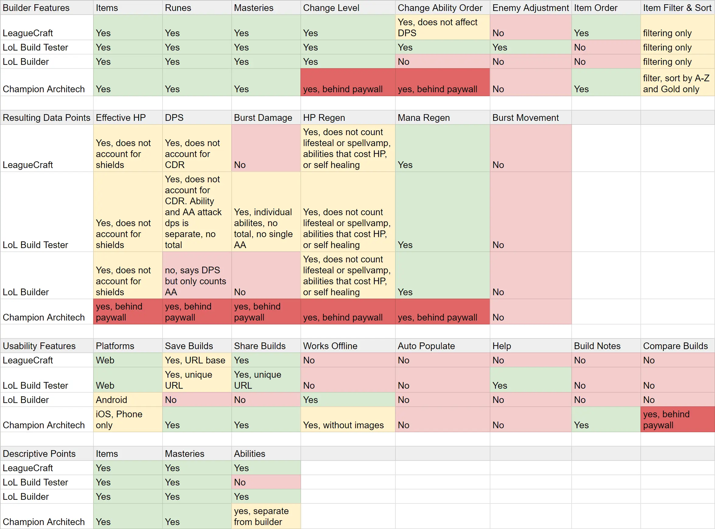
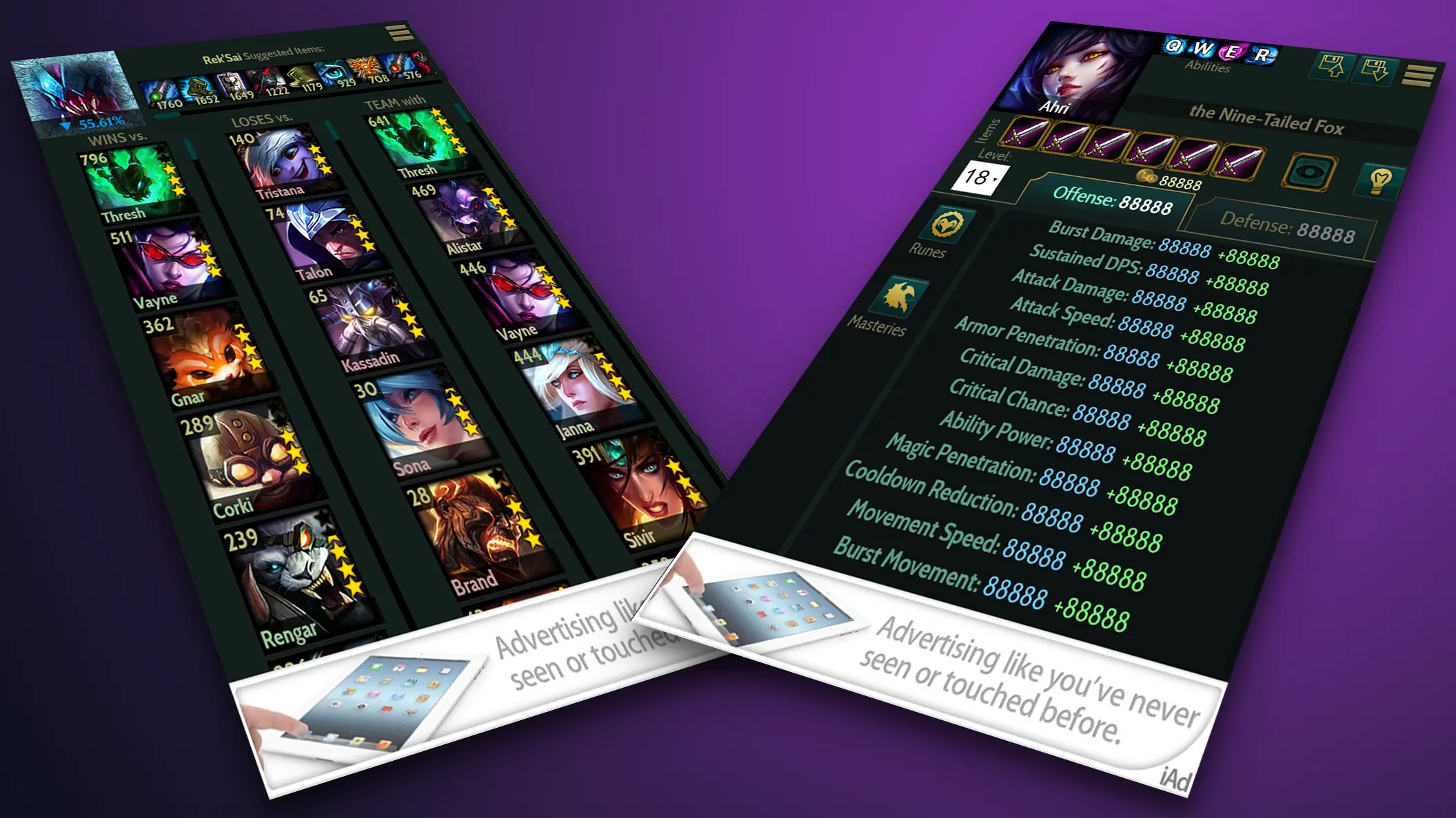
My design process begins with competitive analysis research. I gather and analyze features of similar products to find their strengths and weaknesses; anything we may not be considering for a new product. This first step will establish a baseline feature set. I’ll find opportunities to improve upon existing applications and unique features that can put our product ahead.
Mental Model
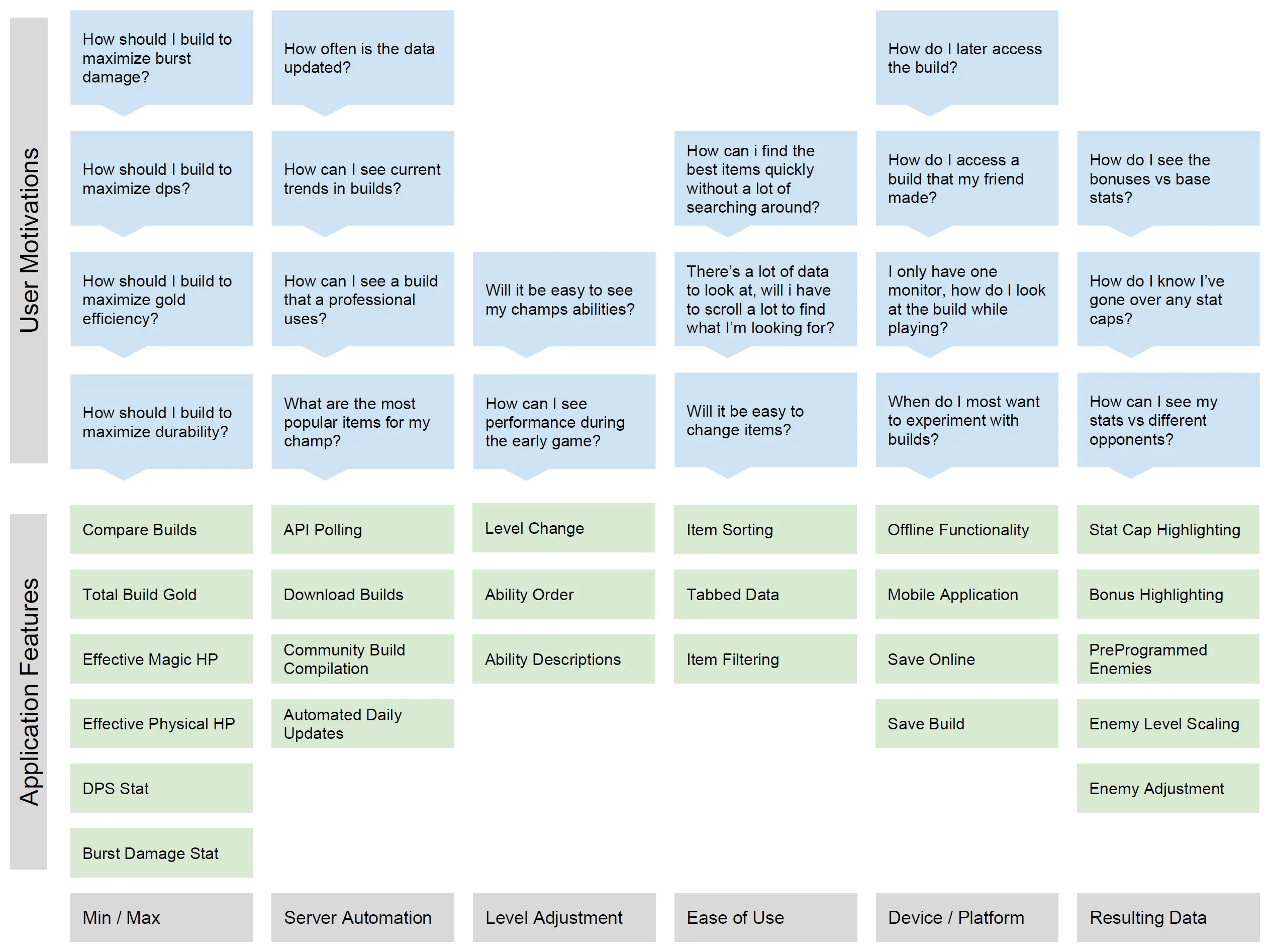
In this step I’ll create a mental model to discover user motivations and align them with features in the product. Part of this step is creating user personas. I’ll organize these user needs into logical sets. This step will identify over-engineered features and opportunities to address user needs better.
Task Analysis
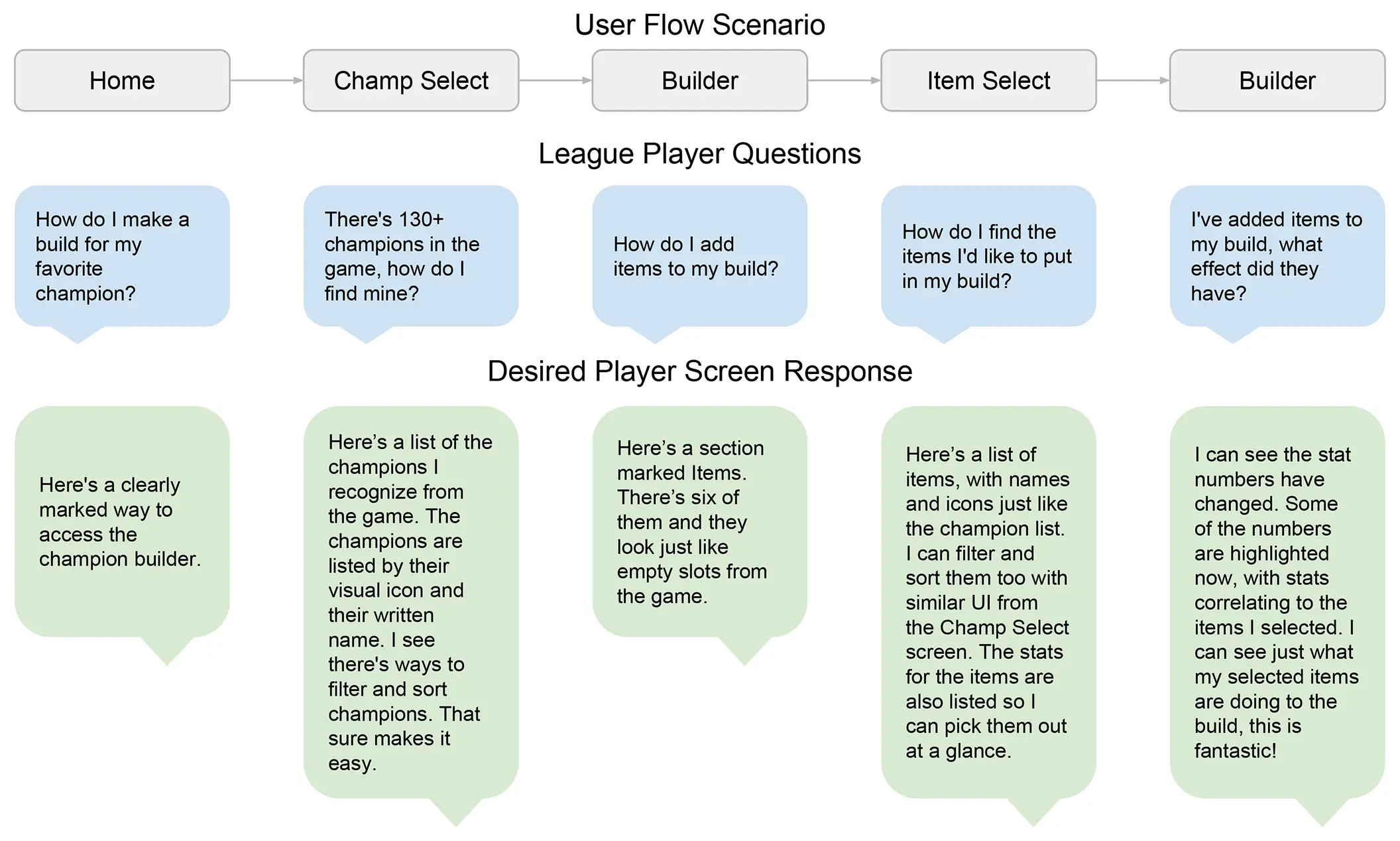
Based on the feature set, I’ll create user flow scenarios. At each step in the flow I’ll analyze typical user thought processes. I’m ensuring that these scenarios drive users toward business goals. I’ll list out desired user reactions to the product during their task flow, this can provide further clarity on feature design.
Red Route Analysis
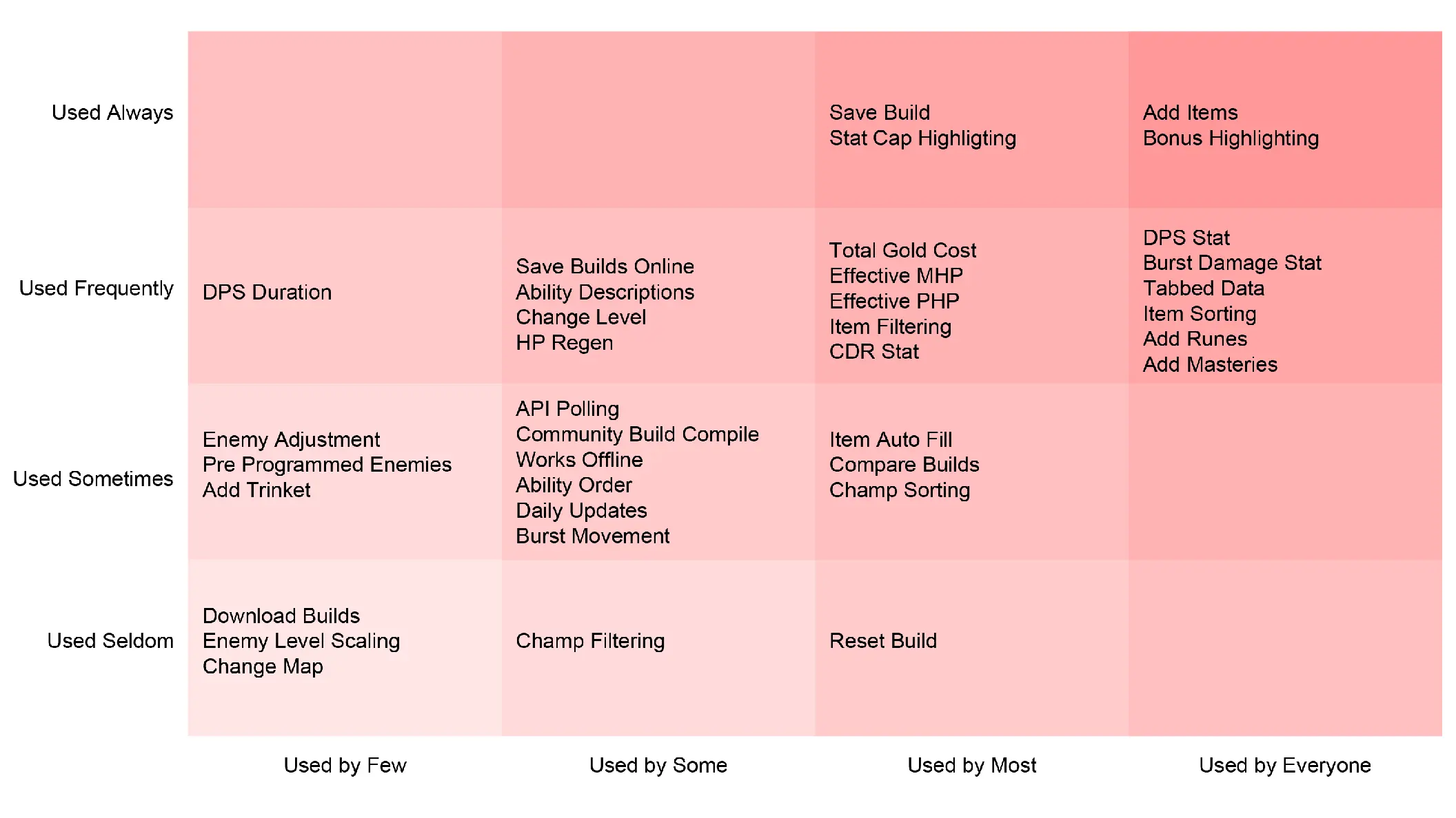
In the red route analysis I’m taking my first step in designing the UI for our product. I organize user goals by projected user base and user frequency. This gives me an idea of where to place priority in the UI, as well as where to put the most design and development effort. I can also discover areas to minimize or trim from the product entirely, promoting a clean interface.
Flow Chart
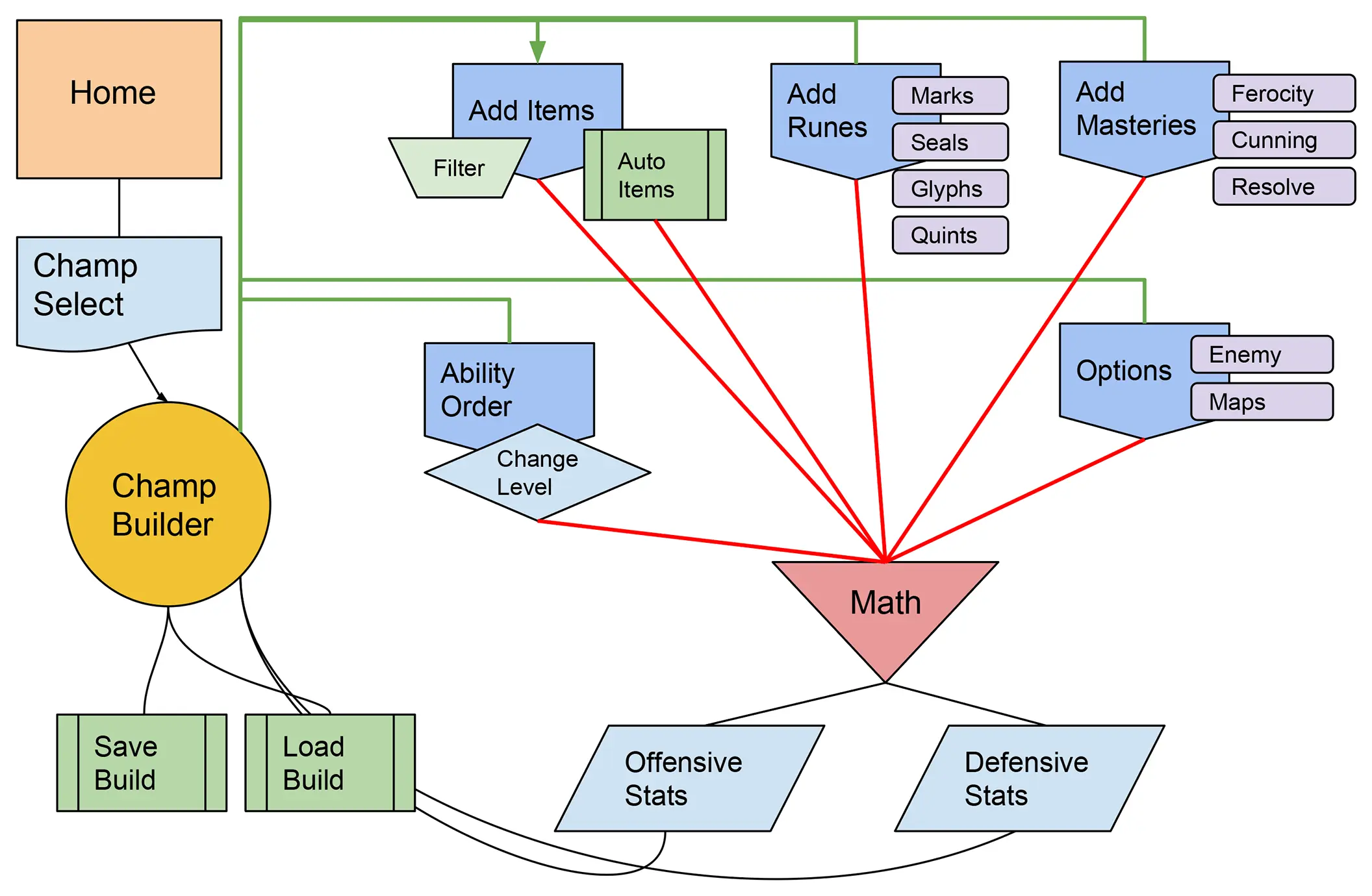
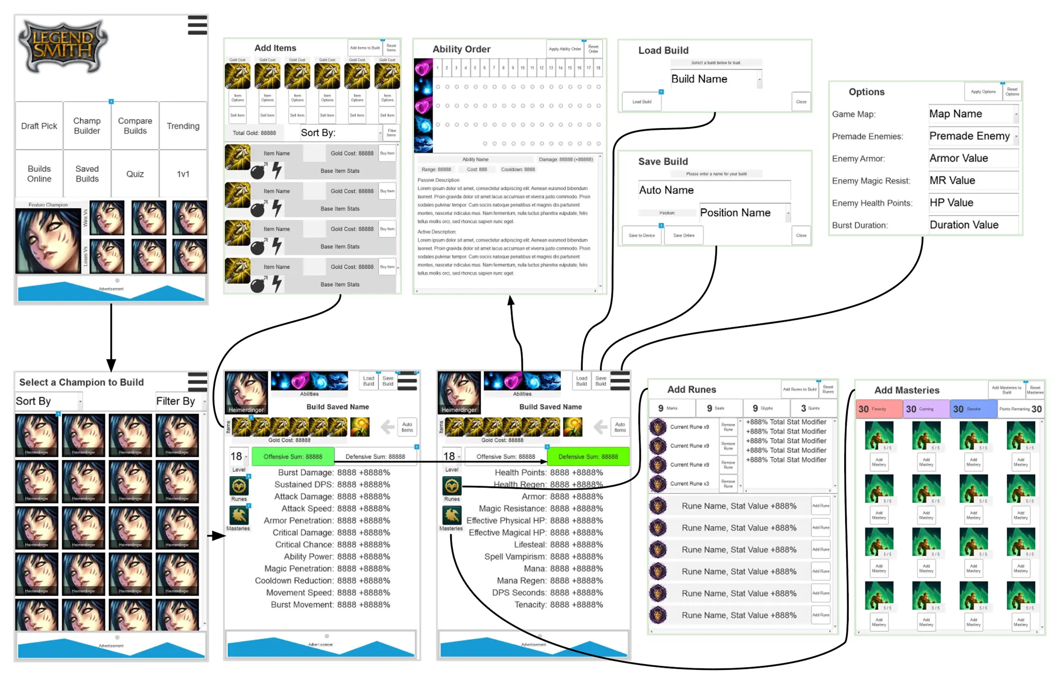
After the red route I can begin making a flow chart. I’ll plan routes between screens, modals, and other interactions. During this step I’ll minimize these connections to streamline user tasks. This chart helps me gather screen requirements like buttons, images, modals, alerts, headings, and other UI devices.
Technical Requirements
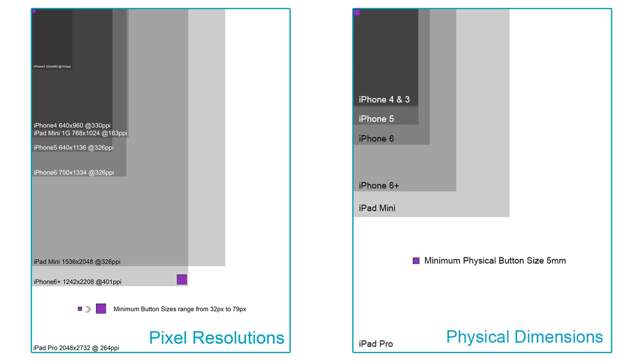
Often technical requirements may be the same from one project to the next, but it’s great to double-check at this point as technology is always on the move. Whether it’s consoles, PCs, or mobiles, I’ll document available resolutions, pixel densities, and physical dimensions. I’m targeting superb usability on the smallest devices while maintaining outstanding fidelity on the largest. My research over the years has found that a 5mm physical size for touch regions is the minimum acceptable size. Some devices may have texture limits such as the 2mb on older Apple devices.
Rapid Prototyping
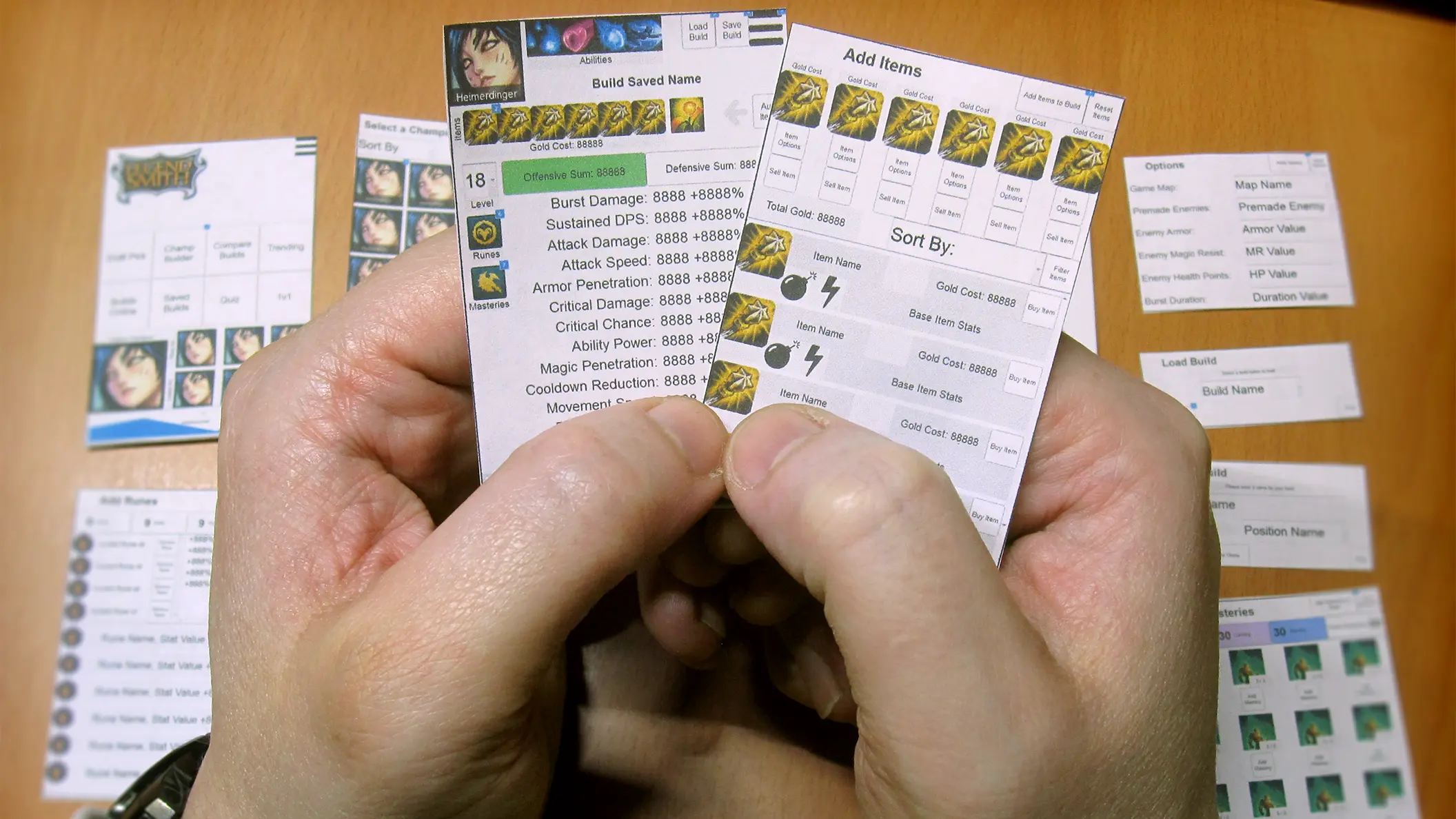
Whether through Figma or printing out the wireframes to device dimensions, I’ll create a quick non-functioning prototype of the product. This can be shared with the team to walk through user tasks and gather feedback. I’ll reference back to the red route to prioritize task analysis. This is the first point where I can begin identifying and addressing usability issues.
Usability Testing
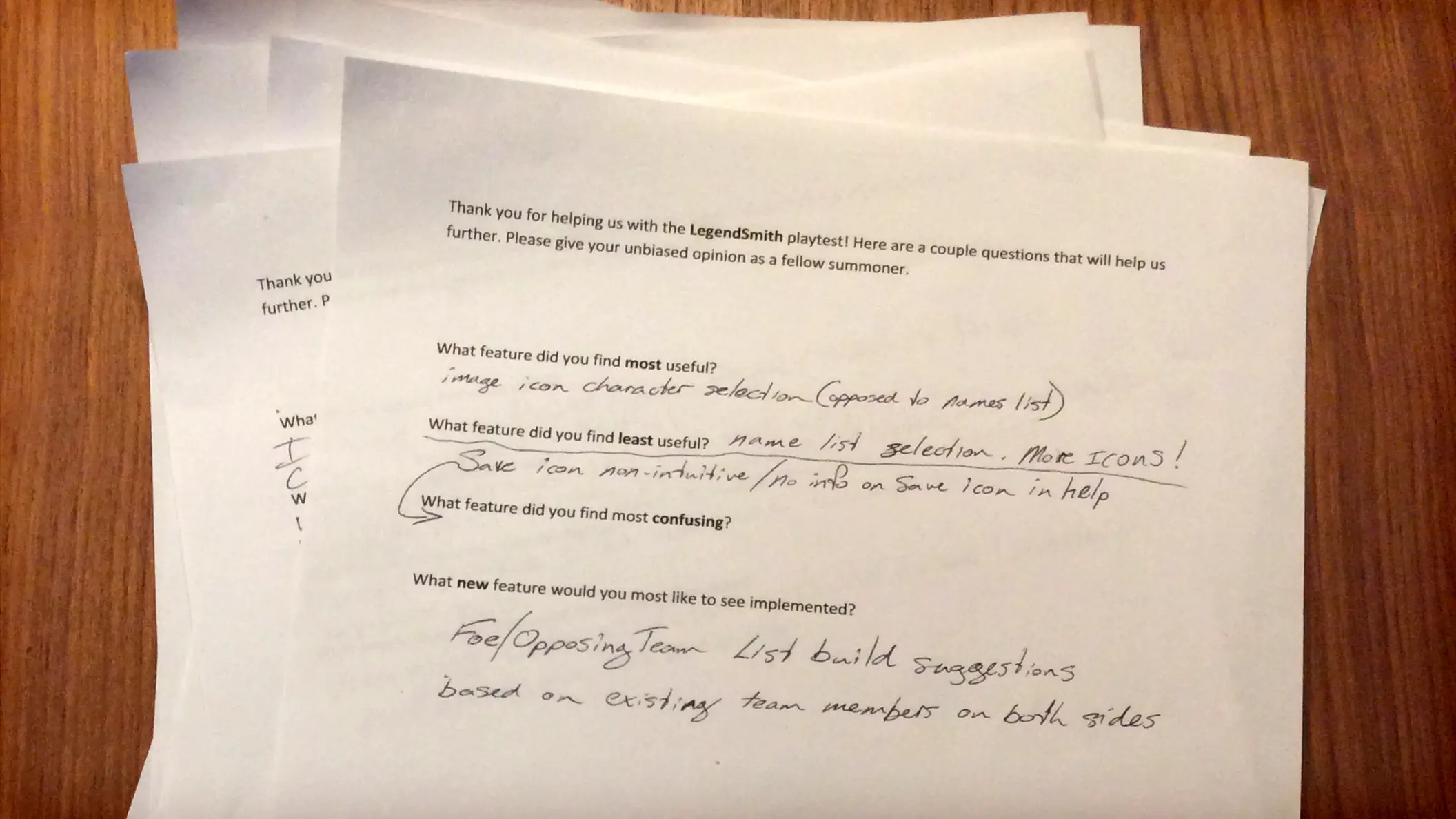
Time to get our new product in front of users outside the development team. I’ll assemble folks of the target demographic, some with varying levels of subject expertise, and some pointedly outside of the target demographic. I’ll create a short questionnaire to gather user feedback, as well as observe direct user interactions, recording when possible. This feedback will give me perspective on adjustments that’ll need to be address before the product goes to market.
User Reviews
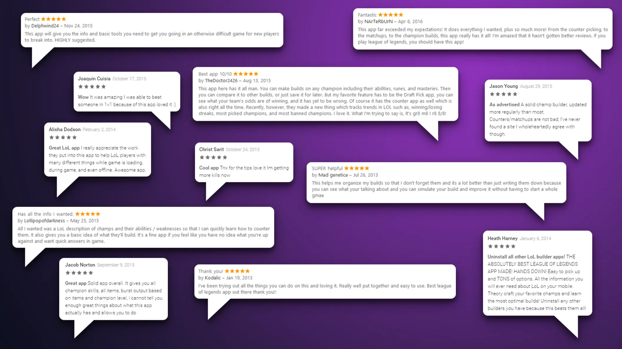
I’ve done the science and the art, this is the result I’m after; outstanding reviews! There’s plenty of real-world feedback here to continue to improve the product. Reviews often reflect the opinions of 10 to 100 times more users that haven’t spoken up. Loyal fans will promote the product for free and are more likely to purchase this and future products. Nice job!

