Character Anvil
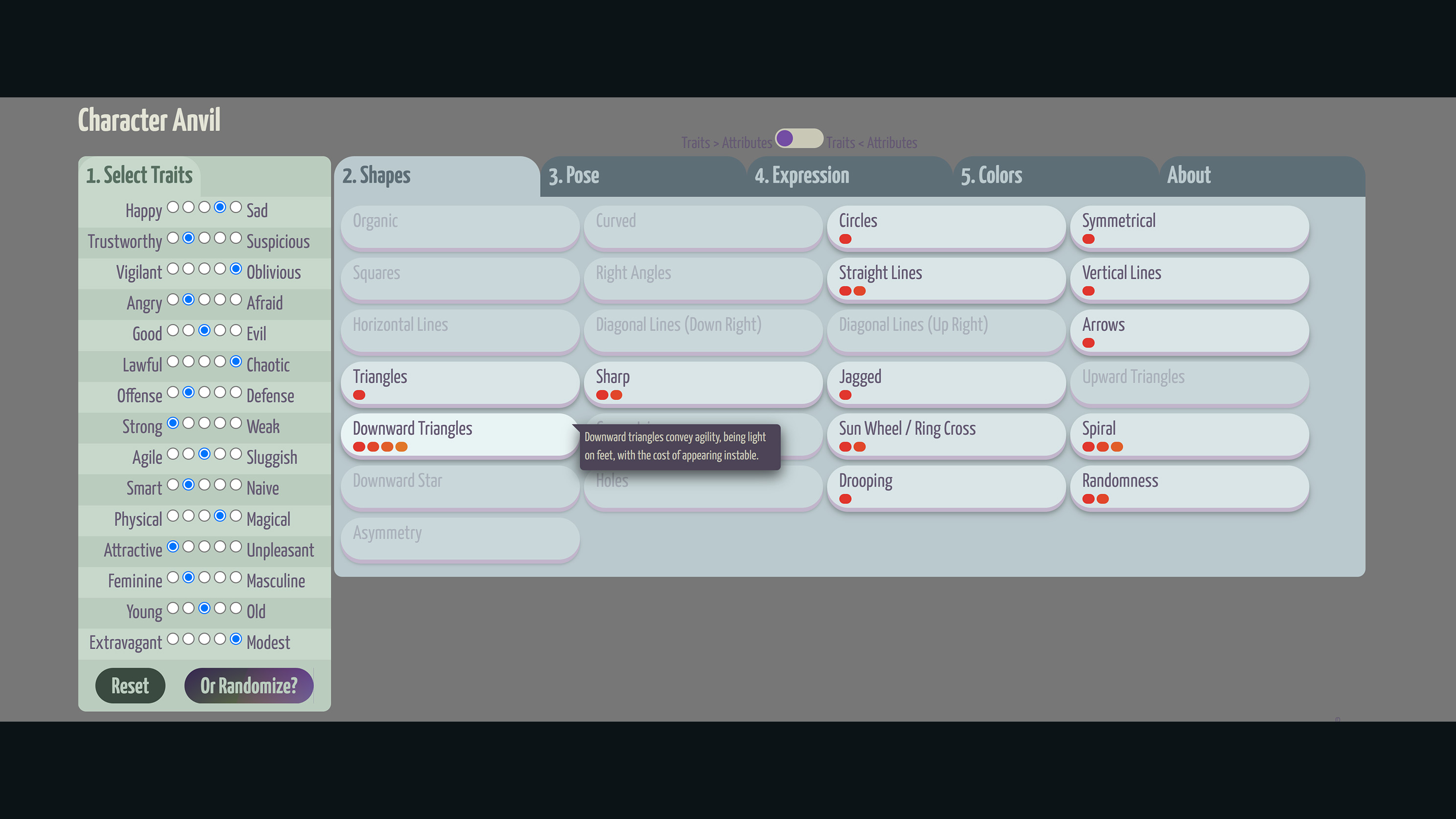
As I get further into character design, I find myself going back and referencing my prior research into character and UX design frequently. I was backtracking so often that I decided to make a quick reference tool for myself. In my research I found that there are personality attributes that are practically opposites; that its quite rare (but not impossible) for someone to be both angry and afraid at the same time. This allowed me to create an algorithm for depicting personalities. Humans are complex of course, but the stories we tell don’t have to be. It’s better to be clear and concise in visual messaging.
Character Anvil gives me a quick way to input the personality I want to portray and get back colors, shapes, poses, and attributes I should use. I use the tool quite often now, not just for characters but also logos, interfaces, and other areas of UX. I like to screenshot the output to attach to development tracking tickets and character profiles.
Upon sharing the tool out, I found there was a use case for reversing the process to break down why a character or UX looks the way it does. I also found users question the validity of the data; a fair question and I’m happy to share my sources. I added links to the referenced research combined into Character Anvil, and some quick tool tips on hover for each attribute that explain the findings.
Grid Calculator
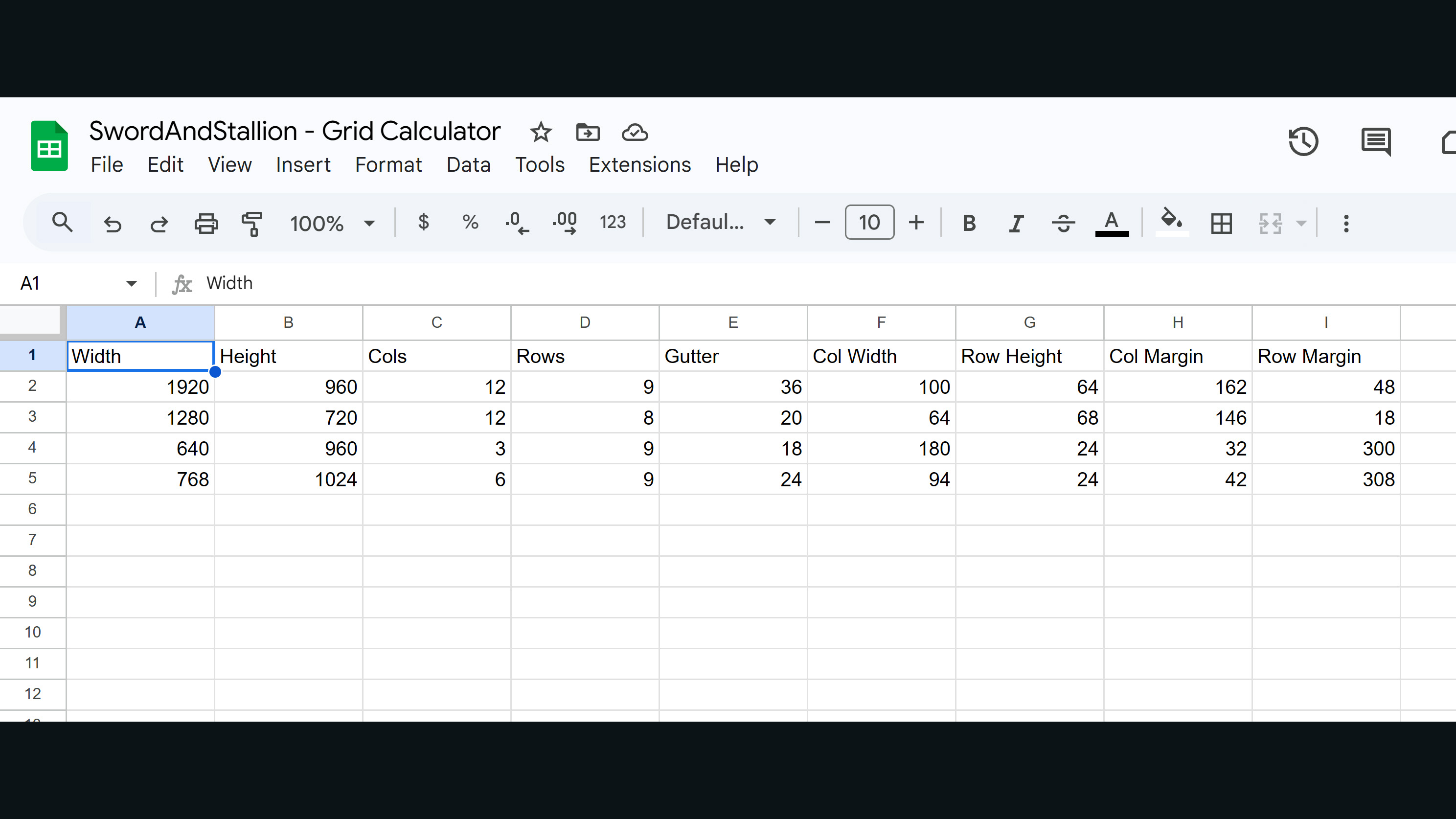
I kick off every interface design by establishing my grid. I’ve worked in responsive design for… a long time, and have worked with many (all) generations of mobile devices. I don’t make assumptions before laying down my foundation, technology changes too fast. So I made myself a simple grid calculator spreadsheet.
By putting in the number of columns and/or rows, and the size of the gutters, I can balance these measurements with margins, in whole pixel units. I like to use multiples of 8, it makes further calculations easy, and stems from our history in developing computer imagery. These calculations contribute to my prowess in “pixel perfect” design, as is evident in my work.
Material Shadow Values
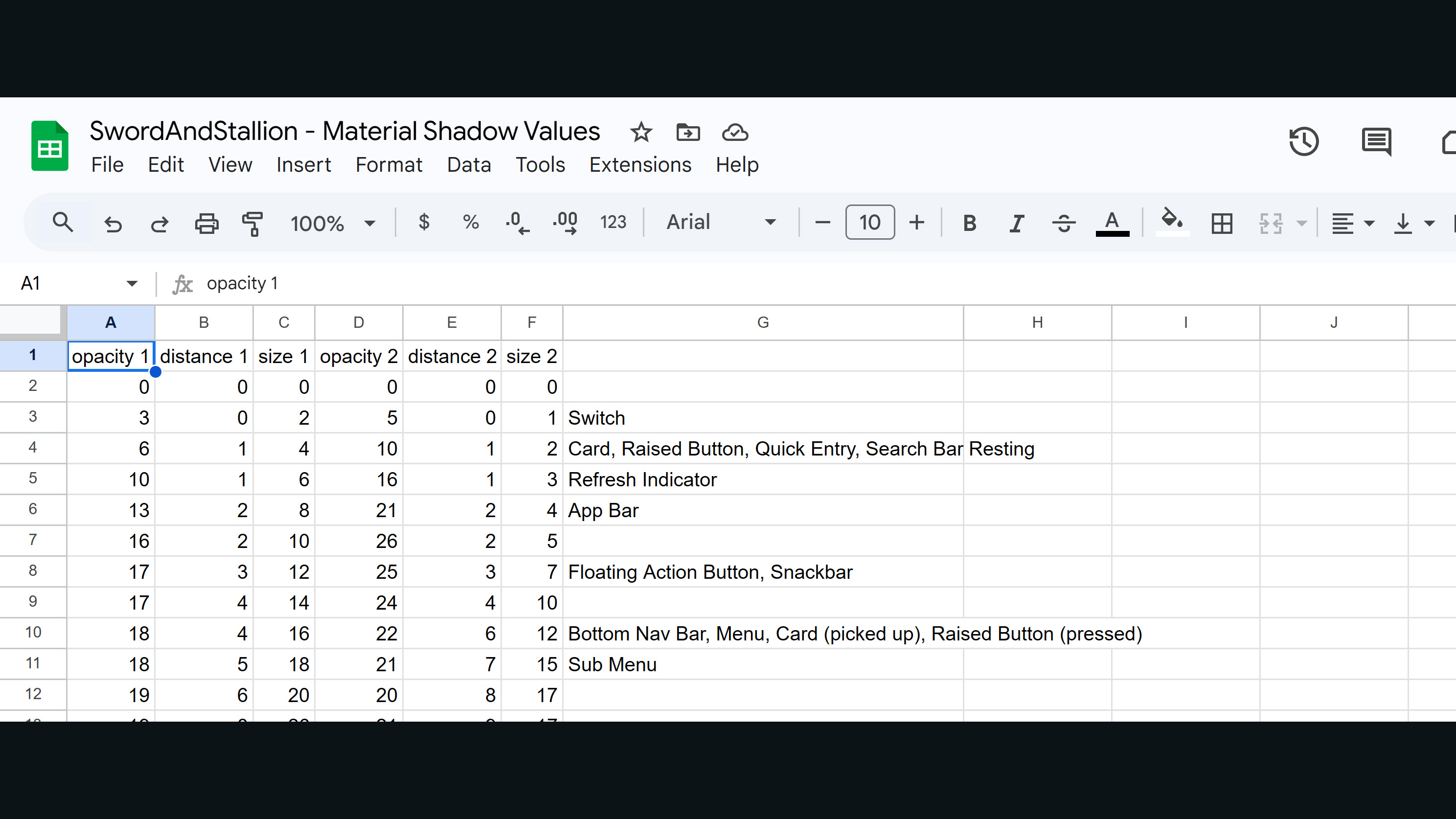
When Google released their “Material Design” guidelines, part of the guide included suggestions for drop shadows to be used on floating UI elements. At the time I was really interested in skeuomorphic design, and still prefer to design by simulating reality, particularly on mobile devices. The Material Design guide was handy, but didn’t break down the measurements and values of shadow into practical numbers for design software.
I made myself a reference by studying the breakdowns of the shadows, analyzing measurements and darkness values using Photoshop. Material design typically uses 2 combined shadows, one smaller and darker, the other lighter and larger. This looks more realistic to us because it’s very rare we’re in an environment with just one light source. Even if there’s just one source of light like the sun, it’s so strong that there’s a bounce light casting a secondary shadow on objects. I added Material Design hierarchy tags to my values for reference. The pixel values are typical for a desktop web experience, and may need to be scaled appropriately for other devices.
Frequent Tools I Use
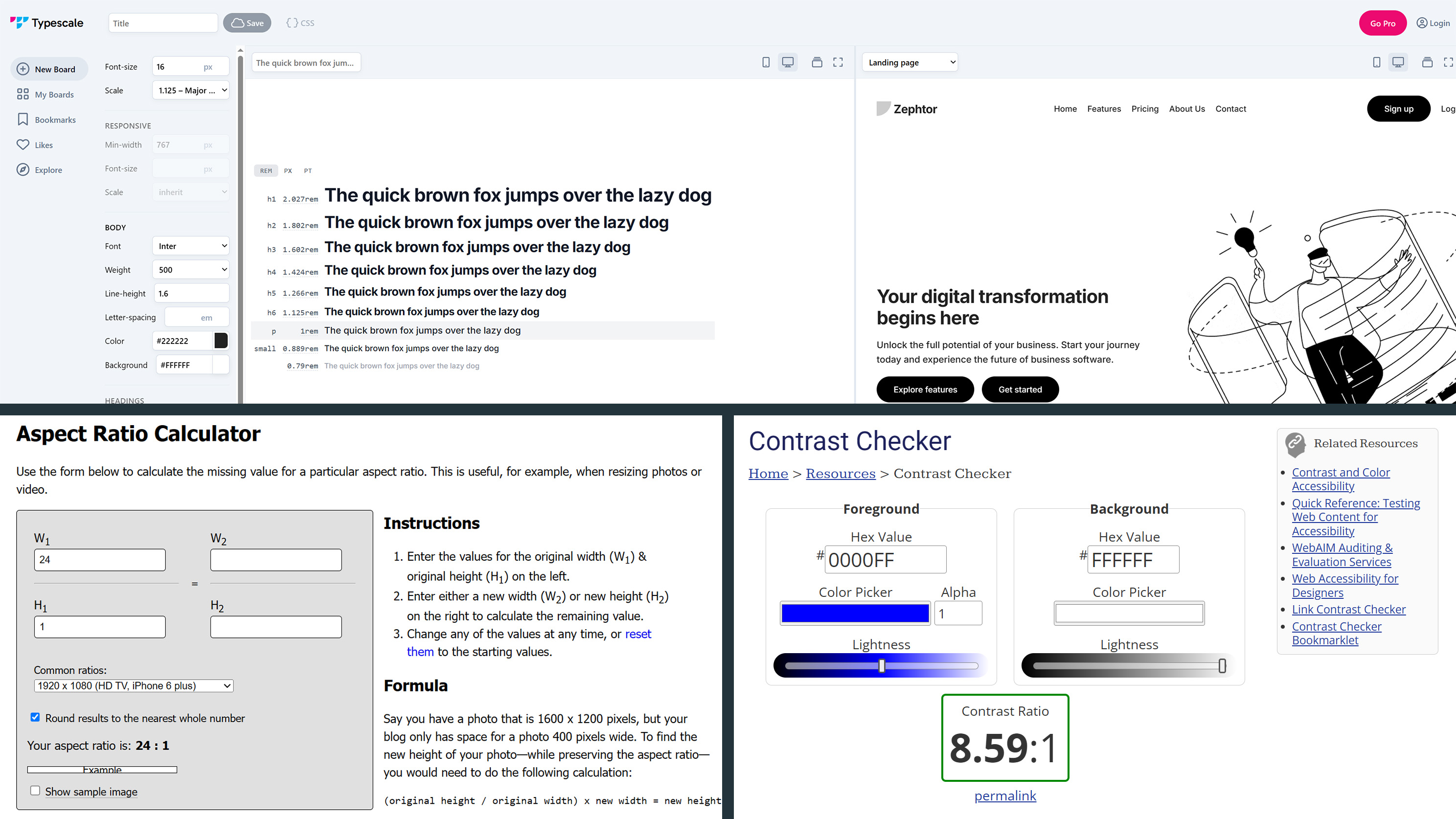
Beyond the typical Figma, Adobe, and Rive tools I use daily, there are several smaller public tools I leverage regularly.
Aspect Ratio Calculator – There are many aspect ratio calculators online, I use this one by Andrew Hedges. It’s been indispensable for responsive pixel perfect design.
Typescale – I use Typescale to establish my font size hierarchy. It’s quick and adjustable, helping keep my font sizes in check. I find Major Second scaling a great choice.
WebAIM Contrast Checker – I recently heard there’s an extension that does the same in Figma. I’ve worked with color so much in Photoshop that I know the contrast luminosity values by heart, but still use this checker to validate my work.


